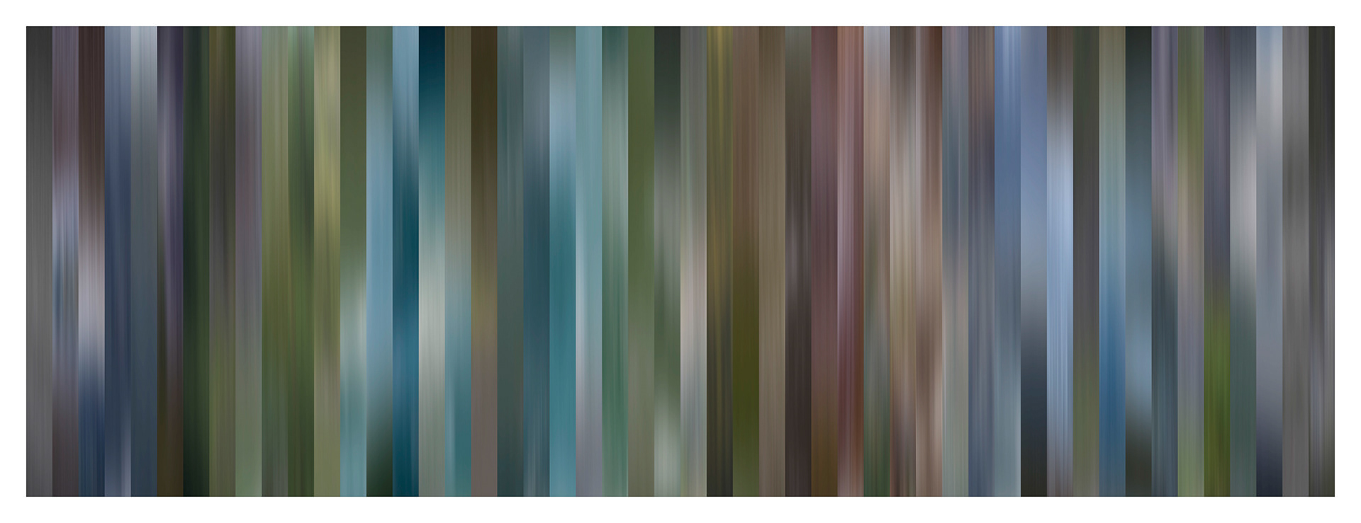
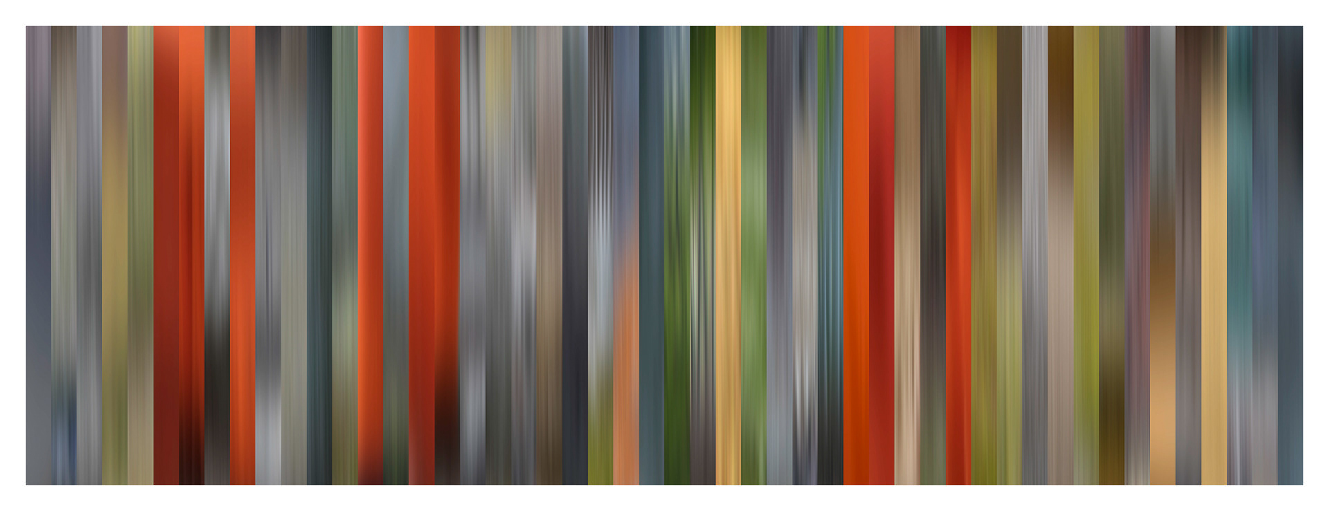
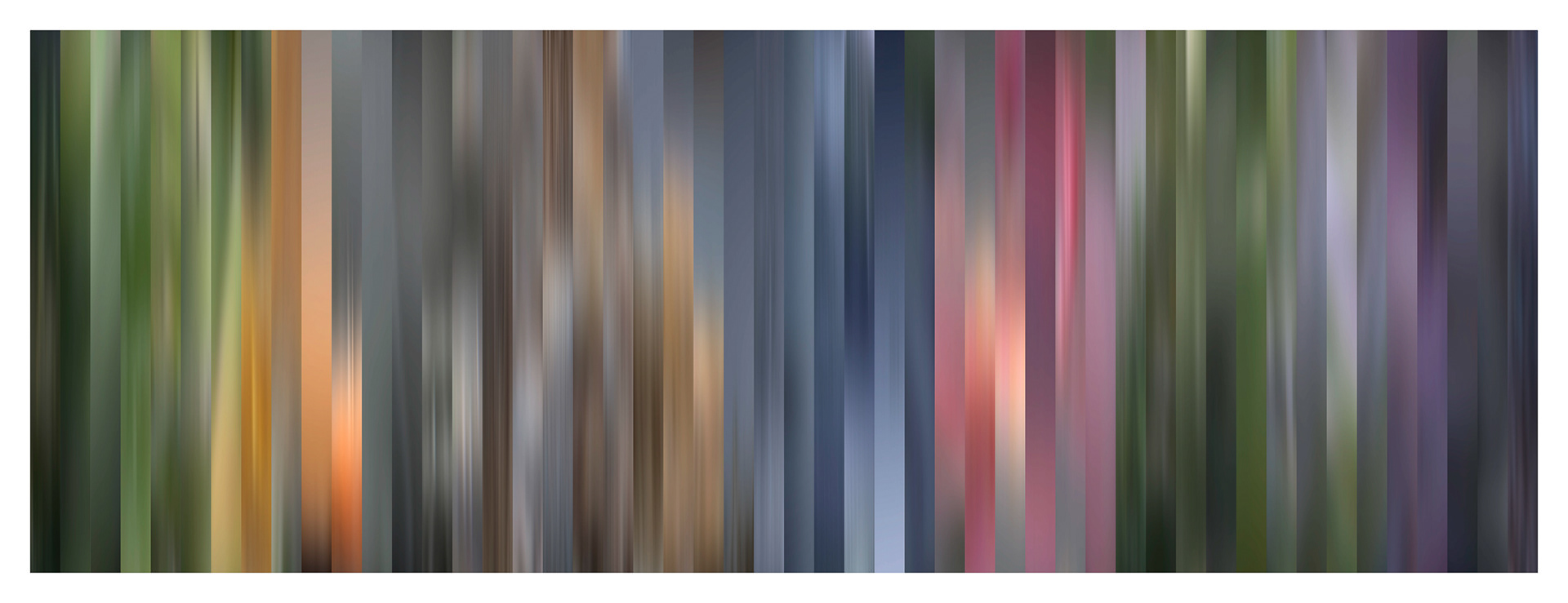
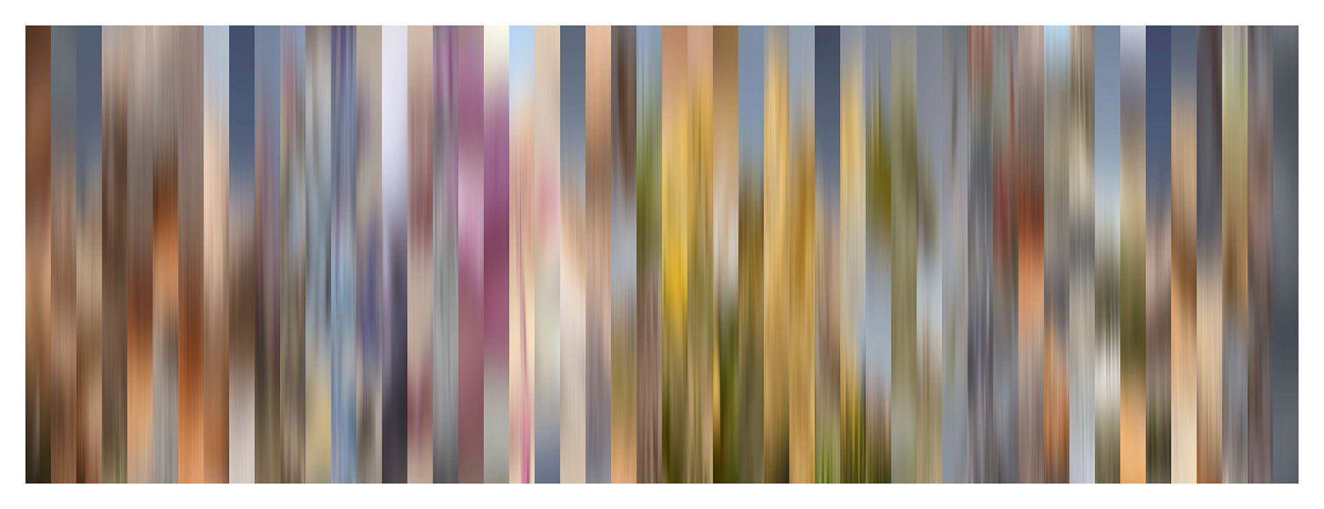
Does every location have a unique color palette? That was the question I set out to explore in my new body of work — "Color of Place". These panoramas include blurred slices from 50 images, stitched together to create a panoramic color palette representing a location. Click here to read an interview about the project.
Every time you take a memory out and play with it, it changes a little bit. —Unknown
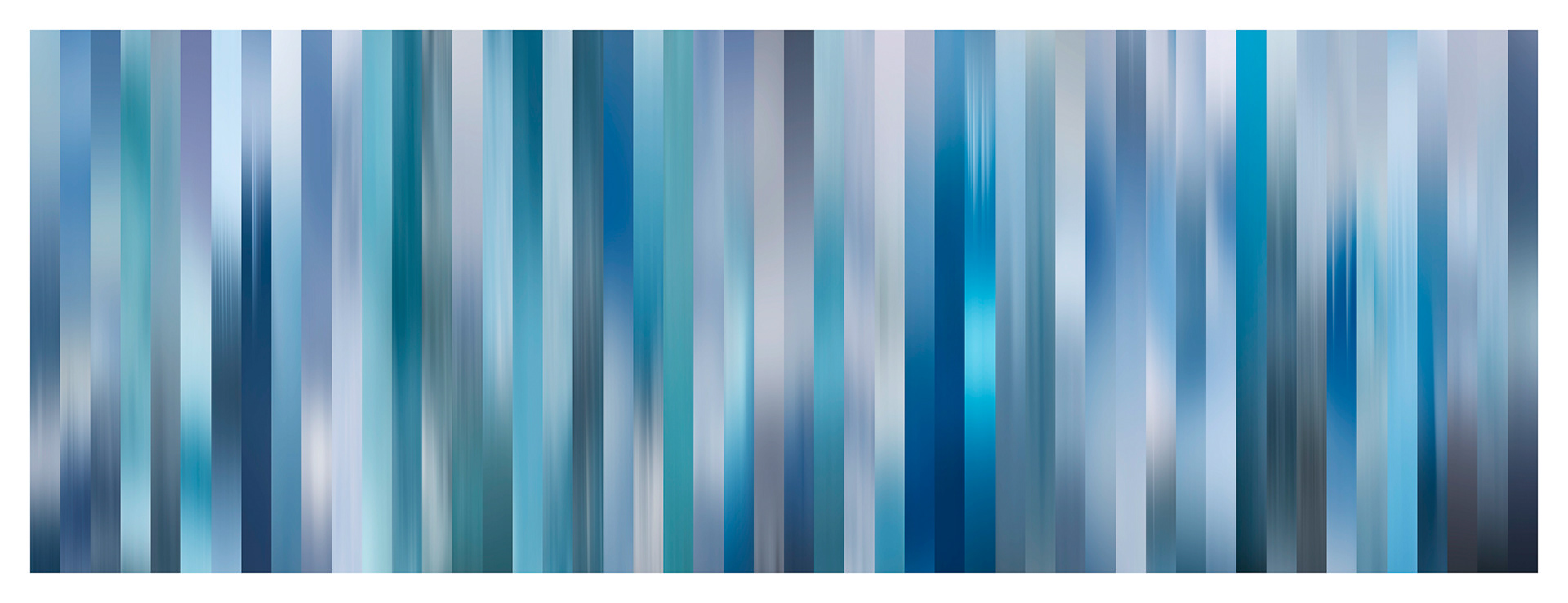
Antarctica, February 22-24, 2016
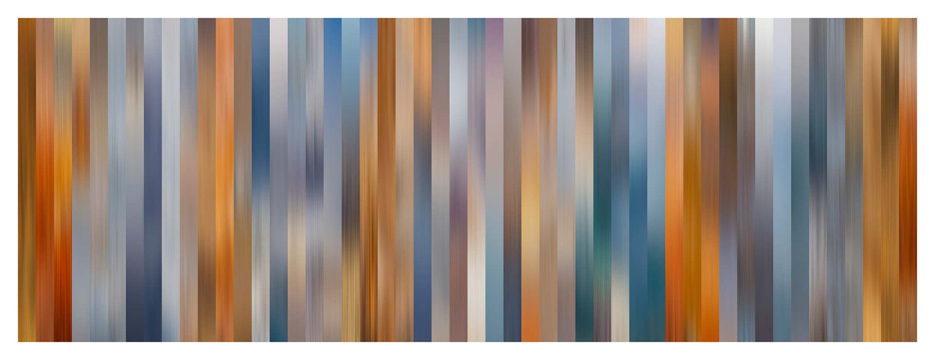
Yellowstone, Wyoming, USA — September 24-25, 2009
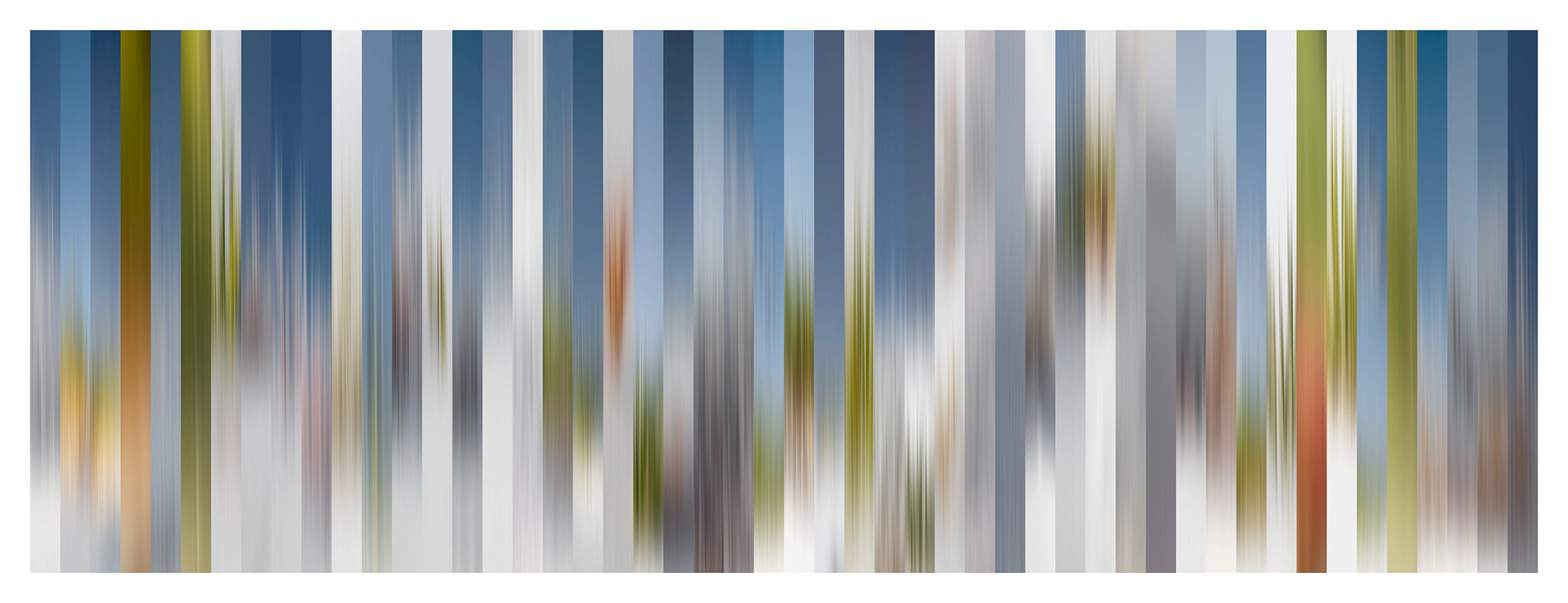
White Sands,New Mexico, USA — April 8-9, 2010

Shanghai, China — July 31-August 3, 2013
Glacier Bay, Alaska, USA — May 19-21, 2009
Kyoto, Japan — February 26-28, 2017
Scottsdale, Arizona, USA — May 26, 2012

Berlin, Germany — March 22-23, 2018
Joshua Tree National Park, California, USA — May 8, 2017

Western Tasmania, Australia — August 4-9, 2017

Halifax, Nova Scotia, Canada — April 23-25, 2012

Brașov, Romania — May 27-29, 2014
Note: While I found that I was able to create a unique color palette for every location specific to the time of my visit, the color palette that I chose to represent that location was far from being objective. First, there were obvious external factors that would bias the color palette such as the locations that I chose to visit, the time of day that I photographed, and the season/weather conditions. Then, there were personal biases such as what subjects I choose to photograph and, what subjects I deliberately avoided. And, there were additional, subjective biases when it came to selecting my “favorite” fifty images, compounded by the discretionary selection of a portion the original, distorted again by the order in which they were arranged. So, while I found it impossible to create a truly objective color palette, I was able to create an image based on how I experienced the location.